間
Ma - Negative Space
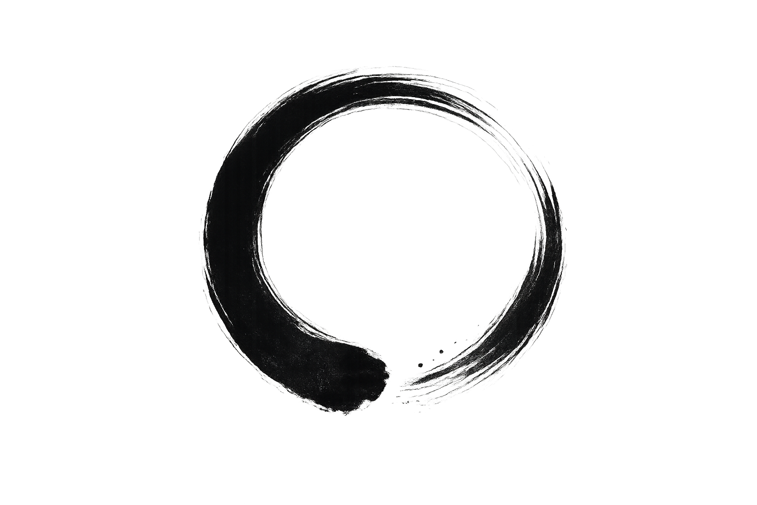
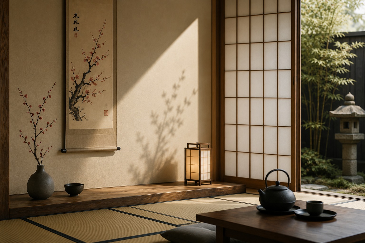
Ma is the conscious use of empty space. It gives the design room to breathe and helps users focus on the most important elements. In Japanese design, space is not empty — it is part of the message.

Design Guide • Japanese Market
A guide for designers and marketers entering the Japanese market.
Understanding the visual language, cultural codes, and aesthetic values that
resonate deeply with Japanese audiences.
Japan is a country where tradition and modernity exists in harmony. Its culture, values and a way of thinking shape a unique approach to design and communication.
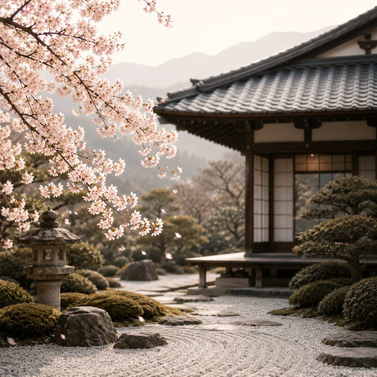

Deeply rooted traditions and a strong sense of harmony. Visitors and locals alike experience a unique aesthetic landscape where the minimalist discipline of Zen gardens and traditional tea ceremonies exists alongside the vibrant worlds of anime and manga.

Communication in Japan is polite, subtle and respectful. Clarity is important, but messages are often conveyed indirectly to preserve harmony and avoid conflict. Tone, context and non-verbal communication are just as meaningful as the words themselves.

Japanese design is guided by simplicity, balance and attention to detail. Traditional values such as harmony, craftsmanship and functionality continue to influence modern products, branding and digital experiences.
Ma is the conscious use of empty space. It gives the design room to breathe and helps users focus on the most important elements. In Japanese design, space is not empty — it is part of the message.
Wabi-Sabi values naturalness, simplicity and imperfection. It creates a calm and authentic feeling through soft textures, organic shapes and subtle details instead of perfect or artificial visuals.
Kanso means reducing a design to what is essential. Unnecessary elements are removed, so the message becomes clearer. The result is a clean, calm and functional visual experience.
Shibui describes quiet and understated beauty. It avoids loud effects and focuses on balance, elegance and refined details. The design feels mature, calm and timeless.
 01
01
Strength, elegance and depth
 02
02
Energy and Tradition
 03
03
Beauty, softness and arrival
 04
04
Prosperity, honor & cultural heritage
 05
05
Natural warmth, simplicity & calm
 06
06
Trust and clarity
 07
07
Neutrality and Balance
 08
08
Purity, simplicity and clarity
Japanese colors are deeply connected to nature, seasons and culture. Red and gold symbolize luck and prosperity, pink represents the beauty of cherry blossoms, blue brings calm and trust, while neutral tones create balance and harmony. Together, these colors create a refined and timeless aesthetic.
Japanese typography is complex and deeply cultural. Vertical text (tategumi) and horizontal text (yokogumi) each carry different weights. Serif typefaces suggest tradition; Gothic (sans-serif) signals modernity.
Use generous line-height (1.8-2.2) and careful tracking. Mix kanji, hiragana, and katakana intentionally - each carries different emotional registers.
Traditional, elegant and cultural
Modern, clear and functional
Refined, calm and premium
Typography in Japan is not just about readability, it is about conveying meaning, emotion and culture.
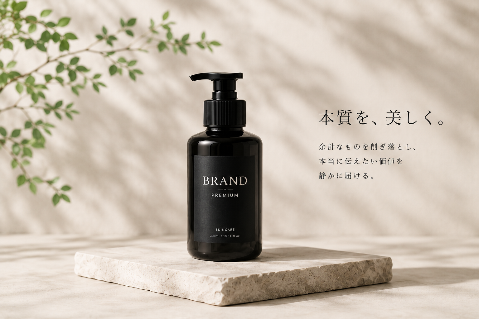
Japanese product presentation focuses on trust, harmony, detail and thoughtful composition.
It's not about selling loudly, but about communicating value with clarity and respect.
 KEY TAKEAWAY
Simplicity is not emptiness. It is making space for what truly matters.

Use space intentionally. Give the product room to breathe.

Provide clear, honest information. Japanese users value details.

Place products in a natural context that reflects lifestyle and values.

Communicate quality through imagery, copy and tone of voice.
Japanese design is not about adding more. It is about removing what is unnecessary and focusing on what truly matters.
Design with purpose.
Communicate with respect.
Japanese design is rooted in harmony, respect and attention to detail.
Successful design is not about attracting attention. It is about creating trust and meaningful experiences.
By understanding cultural values and user experiences, we can create design that truly connects.
Good Japanese design is not about decoration.
It is about intention.
Designing for Japanese market means understanding culture, values and visual expectations before creating design.