Design Guide German Market

Function.
Form.
Wahrheit.

A guide for designers and marketers entering the German market.
Understanding the visual language, cultural codes, and aesthetic values that resonate deeply with German audiences.

[01] About

About Germany

To design effectively for the German market, one must look beyond superficial stereotypes and examine the core psychological anchors: Ordnung (order), Direktheit (directness), and Privatsphäre (privacy).

Historically, German web interfaces prioritized raw functionality, resulting in dense, highly technical layouts. By 2026, the market has undergone a significant shift toward a more premium "warm minimalism".

In digital environments, German users operate with a highly individualistic, goal-oriented mindset focused on personal responsibility and absolute efficiency. Interfaces must serve as stable, predictable environments where uncertainty is actively eliminated.

Platzhalter
[02] Design Principles

DESIGN PRINCIPLES
FOR GERMANY

CONTROL

01

German consumer behavior is heavily shaped by an aversion to risk and a fundamental need for cognitive control. Users expect to understand exactly where they are, what the consequences of a click will be, and how to reverse an action.

CLARITY

02

Explicit cookie-management options, straightforward cancellation flows, and highly intuitive navigation over creative but obscure layouts. Every interaction must be reversible.

TRUST

03

Trust is not won through emotional storytelling or polished marketing claims. It must be systematically earned via verifiable data, certifications, strict privacy compliance and transparent conditions.

[03] Color & Typography

GERMAN COLOR-PALETTE

TYPE & LANGUAGE

Engineering Clarity through Modern Typography Typography in German web design is the primary vehicle for delivering clarity, authority, and institutional trust. The technical realities of the German language require robust, highly legible geometric and neo-grotesque sans-serif typefaces—such as Inter, Suisse, or Neue Haas Grotesk.

To command attention and guide the user through a strict data hierarchy, headlines (Headline Large/Medium) use heavy, definitive weights (Bold / Semi Bold). Conversely, body copy must be formatted with careful tracking and a comfortable, generous line-height to maintain maximum legibility across all desktop and mobile screen resolutions, ensuring that complex informational layouts remain entirely effortless to read.

DISPLAY - BEBAS NEUE

Function before Form

Kursive accent – Fraunces

Precision.

BODY TEXT - DM SANS

German typography is direct and clear. Sans-serif typefaces convey structure and modernity.

[04] Do's & Don'ts

DO'S & DONT'S

DO

  • Use generous white space and negative space as active design elements
  • State all pricing clearly including VAT — never hide fees until checkout
  • Display certifications and test results (TÜV, Stiftung Warentest) prominently
  • Provide explicit, granular cookie consent with a genuine opt-out option
  • Use precise, factual language — back every claim with verifiable evidence
  • Lead product pages with specifications, materials, and technical details first
  • Make cancellation and return flows straightforward and easy to find

DON'T

  • Use dark patterns — hidden fees, forced opt-ins, or obscured cancellation flows
  • Rely on lifestyle imagery or emotional storytelling as your primary trust signal
  • Bury important information behind modals or secondary navigation
  • Pre-select marketing opt-in checkboxes or make opting out harder than opting in
  • Use colloquial language or informal "du" in professional retail contexts

[05] Product Presentation

HOW TO PRESENT YOUR PRODUCT(S)

In the German market, a product must justify itself before it can inspire desire. Where other markets lead with aspiration, Germany demands substance first. The most effective product presentations are architecturally honest: they expose materials, explain specifications, cite independent testing, and state commercial terms without ambiguity. Beauty emerges from precision — not from obscuring it.

IMPORTANT RULES FOR YOUR PRESENTATIONS

QUIET PRESENCE

01

Lead with the product itself. Let quality speak before personality. Restrained visuals communicate confidence and professionalism in the German market.

PREDICTABILITY

02

Specifications, certifications, and third-party test results outperform brand storytelling. German consumers validate claims independently before purchasing.

CLARITY OF TERMS

03

All pricing, delivery timelines, and return conditions must be visible without requiring additional navigation. Ambiguity destroys trust immediately.

PRODUCT PRESENTATION EXAMPLES

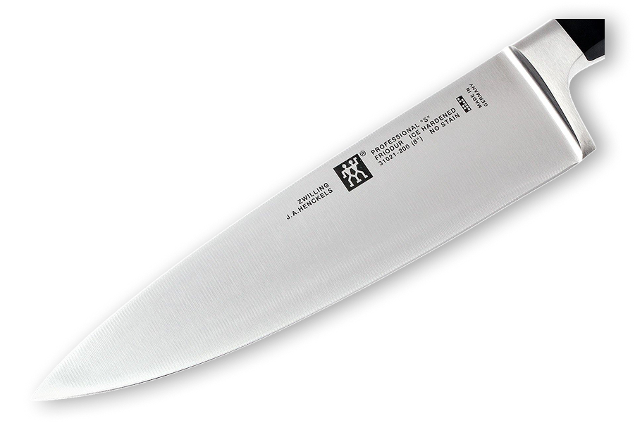
PRECISION FIRST - ZWILLING KNIFE

German engineering at its core. Every blade is stamped from a single piece of Friodur ice-hardened steel, ground by hand to a 15° edge angle. No compromise in material, no compromise in process. The product speaks entirely for itself.

Zwilling Knife

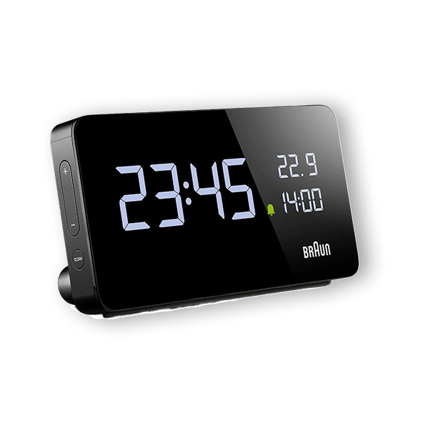
CLEAN & BRAUN CLOCK

Braun's design philosophy since 1955: remove everything that isn't necessary. The BC21 displays exactly what you need – time, date, temperature – in a single, unambiguous glance. No app required. No setup complexity. Dieter Rams called it "good design." Germany calls it standard.

Braun Clock

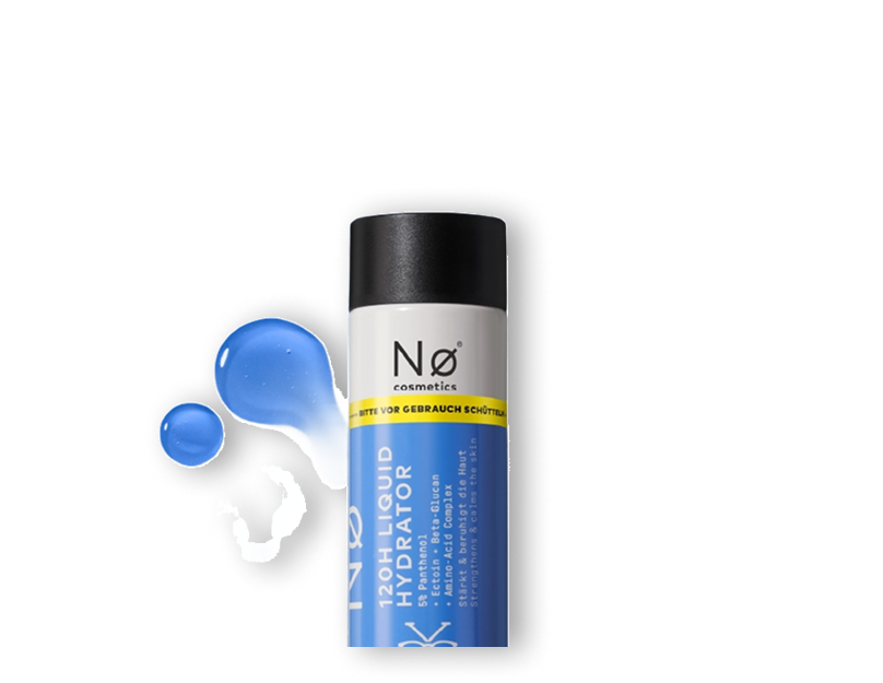
HONEST PRODUCT PRESENTATION – NØ COSMETICS HYDRATOR

No greenwashing. No inflated claims. The Raw Liquid Hydrator lists every active ingredient with its exact concentration, sourced from COSMOS-certified suppliers. Tested independently by Dermatest and rated "Excellent." What's in the bottle is exactly what's on the label.

N∅ Cosmetics

[06] Designing for Germany

DESIGNING FOR GERMANY

German design is not about adding more. It is about removing everything that does not serve a clear purpose — and executing what remains with uncompromising precision.

Design with integrity.
Communicate with clarity.

German design culture is rooted in function, honesty, and long-term thinking. Bauhaus taught us that form follows function. That principle has never lost its relevance — it has only deepened.

Good German design is not about removing character. It is about removing everything that obscures it.